メイン表示の画像下部のサムネイルをクリックで画像が入れ替わるギャラリー 【responsive gallery gh pages】の設置方法を解説します。スマホ表示時には2段となりますがレスポンシブ対応となっています。
プレビュー
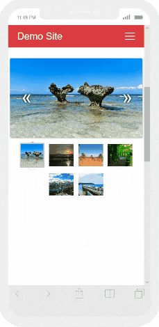
スマホ版プレビュー
LICENSE:MIT
MITライセンスでは、商用利用だけでなく、コピーの使用、複製、変更、統合、公開、配布、サブライセンス、複製物を販売することが認められています。ただし、使用時には著作権表示とライセンス表示をする必要があります。ソースコード上(css、html)内に、著作権およびライセンス表示をすれば、サイト上で公開し表示する義務はありません。参照:MITライセンス(日本語翻訳)
Responsive Gallery ダウンロード
Responsive Gallery 設置方法
Responsive Gallery css 記述方法
スタイルシート(css)『gallery.min.css』は<head></head>内に記述!
<link rel="stylesheet" href="css/gallery.min.css">
Responsive Gallery JavaScript 記述方法
JavaScriptは『hammer.min.js』『main.min.js』<body></body>内の終了タグ直前に記述します。
<script src="js/hammer.min.js"></script>
<script src="js/main.min.js"></script>
Responsive Gallery 設置例
 <!DOCTYPE html>
 <html lang="ja">
 <head>
 <meta charset="UTF-8">
 <meta name="viewport" content="width=device-width,initial-scale=1.0,minimum-scale=1.0">
     <title>サムネイルクリックで画像が入れ替わる レスポンシブギャラリー 【responsive gallery gh pages】デモ </title>
     <link rel="stylesheet" href="style.css">

     <link rel="stylesheet" href="css/gallery.min.css">

 </head>
 <body>
     <div class="container">
         <h1>Responsive Gallery デモ </h1>

  <div class="main-container">
    <div class="main wrapper clearfix">
      <article>
        <section>
          <div id="mygallery" class="gallery">
            <div class="images">
              <div class="active" style="background-image: url(img/01.jpg)"></div>
              <div style="background-image: url(img/02.jpg)"></div>
              <div style="background-image: url(img/03.jpg)"></div>
              <div style="background-image: url(img/04.jpg)"></div>
              <div style="background-image: url(img/05.jpg)"></div>
              <div style="background-image: url(img/06.jpg)"></div>
              <span class="left"></span>
              <span class="right"></span>
            </div>
            <div class="thumbs">
              <div class="active" style="background-image: url(img/01.jpg)"></div>
              <div style="background-image: url(img/02.jpg)"></div>
              <div style="background-image: url(img/03.jpg)"></div>
              <div style="background-image: url(img/04.jpg)"></div>
              <div style="background-image: url(img/05.jpg)"></div>
              <div style="background-image: url(img/06.jpg)"></div>
            </div>
          </div>
        </section>
      </article>
    </div>
  </div>

<script src="js/hammer.min.js"></script>
<script src="js/main.min.js"></script>

     </div>
 </body>
 </html>

こんにちは。【検索上位表示ホームページ制作】中小企業様の集客に特化したコンテンツ作成&Webマーケティングのアドバイザーをしております。貴社の魅力を引き出し大企業と渡り合えるコンテンツ作りには自信がございます。Web事業歴15年目。「地域一番を目指したい」と言うweb担当者様お気軽にご相談ください。