PCでは見えないコンテンツ(タブやアコーディオン)に関してはSEO的に評価されないとされてきましたが、モバイルファーストインデック(スマホサイトをページ評価の基準)が開始されサポートされるようになるとUXの重要度も増し、今やUIに欠かせないアコーディオンメニュー!「jQuery」で実装が主流の中、jQueryを使わずに、CSS + HTML だけでレスポンシブ対応のアコーディオンを簡単に実装する方法3タイプをご紹介します。
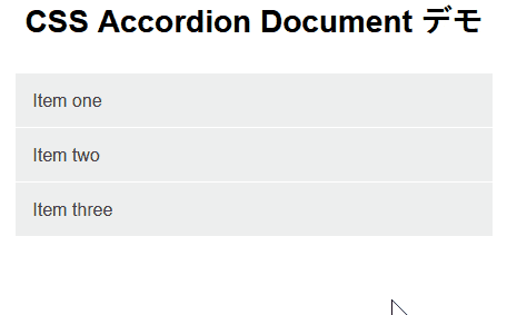
CSS Accordion【Document】
CSS Accordion タイプ1 プレビュー
CSS Accordion タイプ1 HTML
<div class="accordion">
     <label for="one" class="accordionitem">Item one</label>
     <input type="checkbox" id="one"/>
     <p class="hiddentext">Item one アコーディオン内コンテンツ</p>
</div>

<div class="accordion">
     <label for="two" class="accordionitem">Item two</label>
     <input type="checkbox" id="two"/>
     <p class="hiddentext">Item two アコーディオン内コンテンツ</p>
</div>

<div class="accordion">
     <label for="three" class="accordionitem">Item three</label>
     <input type="checkbox" id="three"/>
     <p class="hiddentext">Item three アコーディオン内コンテンツ</p>
</div>
CSS Accordion タイプ1 CSS
.accordion label {
  display: block;
  background-color: #eeeeee;
  padding: 15px 15px;
  color: #424242;
  cursor: pointer;
  border-top: 1px solid #ffffff;
}
.accordion p {
  opacity: 0;
  display: none;
  background-color: #fff;
  padding: 15px;
}
/* change id to relate to new html */
#one:checked~.hiddentext {
  display: block;
  opacity: 1;
}
input#one {
  display: none;
  position: relative;
}
#two:checked~.hiddentext {
  display: block;
  opacity: 1;
}
input#two {
  display: none;
  position: relative;
}
#three:checked~.hiddentext {
  display: block;
  opacity: 1;
}
input#three {
  display: none;
  position: relative;
}
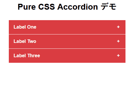
Pure CSS Accordion
CSS Accordion タイプ2 プレビュー
CSS Accordion タイプ2 HTML
<div class="half">

  <div class="tab">
    <input id="tab-one" type="checkbox" name="tabs">
    <label for="tab-one">Label One</label>
    <div class="tab-content">
      <p>https://codepen.io/franzcyril/pen/xjdVGq<br><br>Label One 内コンテンツ</p>
    </div>
  </div>

  <div class="tab">
    <input id="tab-two" type="checkbox" name="tabs">
    <label for="tab-two">Label Two</label>
    <div class="tab-content">
      <p>Label Two 内コンテンツ</p>
    </div>
  </div>

  <div class="tab">
    <input id="tab-three" type="checkbox" name="tabs">
    <label for="tab-three">Label Three</label>
    <div class="tab-content">
      <p>Label Three 内コンテンツ</p>
    </div>
  </div>

</div>
CSS Accordion タイプ2 CSS
.half {
  float: left;
  width: 100%;
  padding: 0 1em;
}
/* Acordeon styles */
.tab {
  position: relative;
  margin-bottom: 1px;
  width: 100%;
  color: #fff;/* アコーディオン タブ文字色 */
  overflow: hidden;
}
input {
  position: absolute;
  opacity: 0;
  z-index: -1;
}
label {
  position: relative;
  display: block;
  padding: 0 0 0 1em;
  background: #da3c41;/* アコーディオン タブ背景色 */
  font-weight: bold;
  line-height: 3;
  cursor: pointer;
}
.blue label {
  background: #2980b9;
}
.tab-content {
  max-height: 0;
  overflow: hidden;
  background: #f2f2f2;/* タブ内背景色 */
  -webkit-transition: max-height .35s;
  -o-transition: max-height .35s;
  transition: max-height .35s;
}
.blue .tab-content {
  background: #3498db;
}
.tab-content p {
  margin: 1em;
  color: #000;/* タブ内文字色 */
}
/* :checked */
input:checked ~ .tab-content {
  max-height: 10em;
}
/* Icon */
label::after {
  position: absolute;
  right: 0;
  top: 0;
  display: block;
  width: 3em;
  height: 3em;
  line-height: 3;
  text-align: center;
  -webkit-transition: all .35s;
  -o-transition: all .35s;
  transition: all .35s;
}
input[type=checkbox] + label::after {
  content: "+";
}
input[type=radio] + label::after {
  content: "\25BC";
}
input[type=checkbox]:checked + label::after {
  transform: rotate(315deg);
}
input[type=radio]:checked + label::after {
  transform: rotateX(180deg);
}
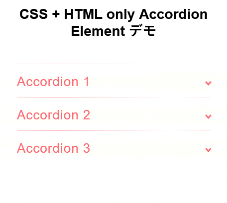
CSS + HTML only Accordion Element
CSS3 Accordion タイプ3 プレビュー
CSS Accordion タイプ3 ライセンス
| 著者 | Leontiev Aleksey |
|---|---|
| 公式ページ | website |
| デモページ | collapsible.js |
| 最後の更新 | 2016年6月14日 |
| ライセンス | MIT |
CSS Accordion タイプ2 HTML
<ul>

  <li> <input type="checkbox" checked> <i></i>
    <h2>Accordion 1</h2>
    <p>コンテンツ 1</p>
  </li>

  <li> <input type="checkbox" checked> <i></i>
    <h2>Accordion 2</h2>
    <p>コンテンツ2</p>
  </li>

  <li> <input type="checkbox" checked> <i></i>
    <h2>Accordion 3</h2>
    <p>コンテンツ3</p>
  </li>

</ul>
CSS Accordion タイプ2 CSS
.transition, p, ul li i:before, ul li i:after {
  transition: all 0.25s ease-in-out;
}
.flipIn, h1, ul li {
  animation: flipdown 0.5s ease both;
}
.no-select, h2 {
  -webkit-tap-highlight-color: rgba(0, 0, 0, 0);
  -webkit-touch-callout: none;
  -webkit-user-select: none;
  -khtml-user-select: none;
  -moz-user-select: none;
  -ms-user-select: none;
  user-select: none;
}

p {
  color: rgba(48, 69, 92, 0.8);
  font-size: 17px;
  line-height: 26px;
  letter-spacing: 1px;
  position: relative;
  overflow: hidden;
  max-height: 800px;
  opacity: 1;
  transform: translate(0, 0);
  margin-top: 14px;
  z-index: 2;
}

ul {
  list-style: none;
  perspective: 900;
  padding: 0;
  margin: 0;
}
ul li {
  position: relative;
  padding: 0;
  margin: 0;
  padding-bottom: 4px;
  padding-top: 18px;
  border-top: 1px dotted #ff6873;
}
ul li:nth-of-type(1) {
  animation-delay: 0.5s;
}
ul li:nth-of-type(2) {
  animation-delay: 0.75s;
}
ul li:nth-of-type(3) {
  animation-delay: 1s;
}
ul li:last-of-type {
  padding-bottom: 0;
}
ul li i {
  position: absolute;
  transform: translate(-6px, 0);
  margin-top: 16px;
  right: 0;
}
ul li i:before, ul li i:after {
  content: "";
  position: absolute;
  background-color: #ff6873;
  width: 3px;
  height: 9px;
}
ul li i:before {
  transform: translate(-2px, 0) rotate(45deg);
}
ul li i:after {
  transform: translate(2px, 0) rotate(-45deg);
}
ul li input[type=checkbox] {
  position: absolute;
  cursor: pointer;
  width: 100%;
  height: 100%;
  z-index: 1;
  opacity: 0;
}
ul li input[type=checkbox]:checked ~ p {
  margin-top: 0;
  max-height: 0;
  opacity: 0;
  transform: translate(0, 50%);
}
ul li input[type=checkbox]:checked ~ i:before {
  transform: translate(2px, 0) rotate(45deg);
}
ul li input[type=checkbox]:checked ~ i:after {
  transform: translate(-2px, 0) rotate(-45deg);
}

@keyframes flipdown {
  0% {
    opacity: 0;
    transform-origin: top center;
    transform: rotateX(-90deg);
  }
  5% {
    opacity: 1;
  }
  80% {
    transform: rotateX(8deg);
  }
  83% {
    transform: rotateX(6deg);
  }
  92% {
    transform: rotateX(-3deg);
  }
  100% {
    transform-origin: top center;
    transform: rotateX(0deg);
  }
}

こんにちは。【検索上位表示ホームページ制作】中小企業様の集客に特化したコンテンツ作成&Webマーケティングのアドバイザーをしております。貴社の魅力を引き出し大企業と渡り合えるコンテンツ作りには自信がございます。Web事業歴15年目。「地域一番を目指したい」と言うweb担当者様お気軽にご相談ください。